J.W. Faria
Logo, Album Design, and Branding

J.W. Faria
Logo, Album Design, and Branding
WHAT: J.W. Faria is a country musician based out of Nashville, TN. I was tasked with creating a set of logos, single covers, and the layout for his first album release. While each design had a unique aesthetic, my goal was to unify all of the branding for his marketing campaign. The main challenge for this project came from creating the designs based on descriptions of the client’s interests, inspirations, and aspirations. I was the sole designer for this project and led the overall art direction.
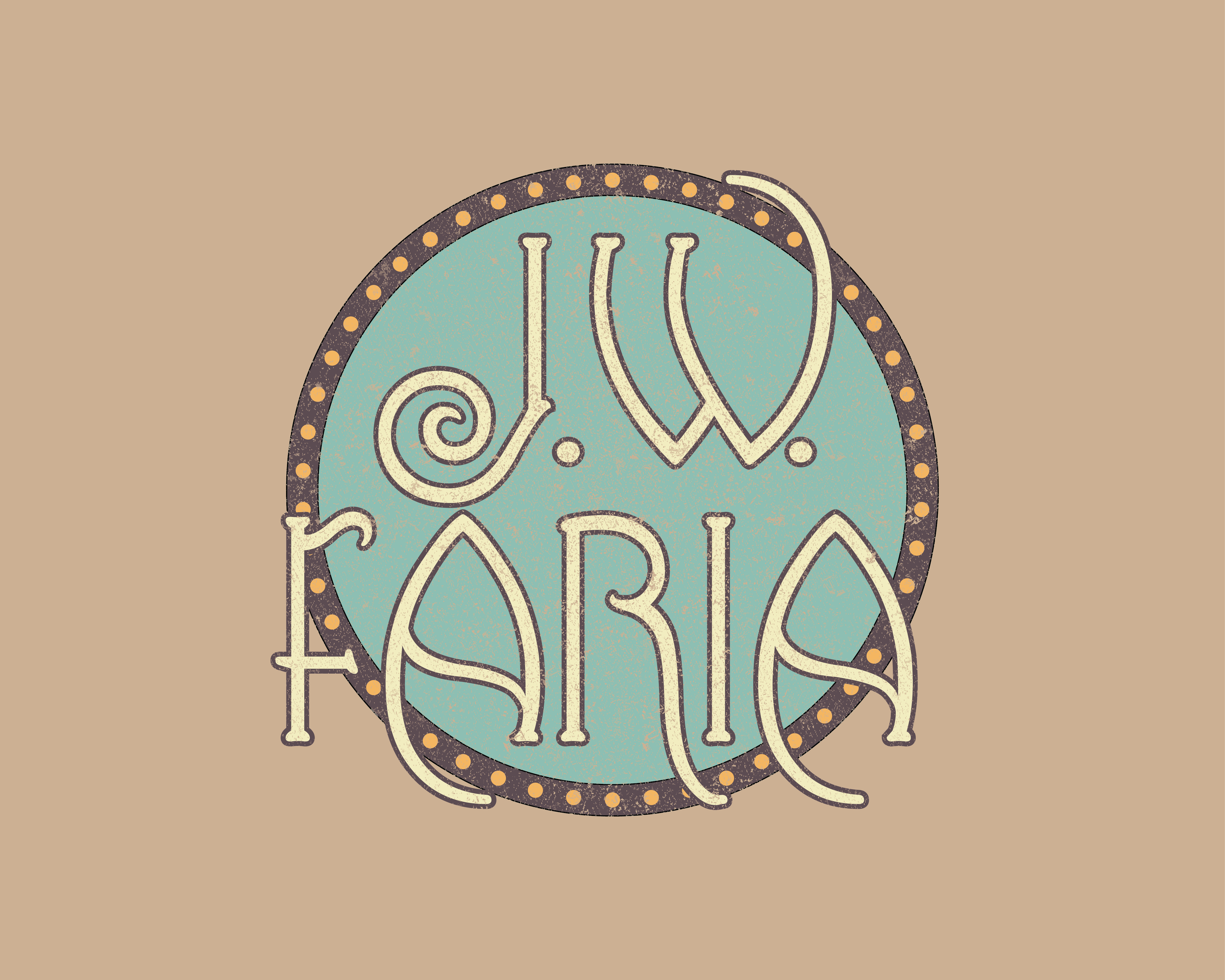
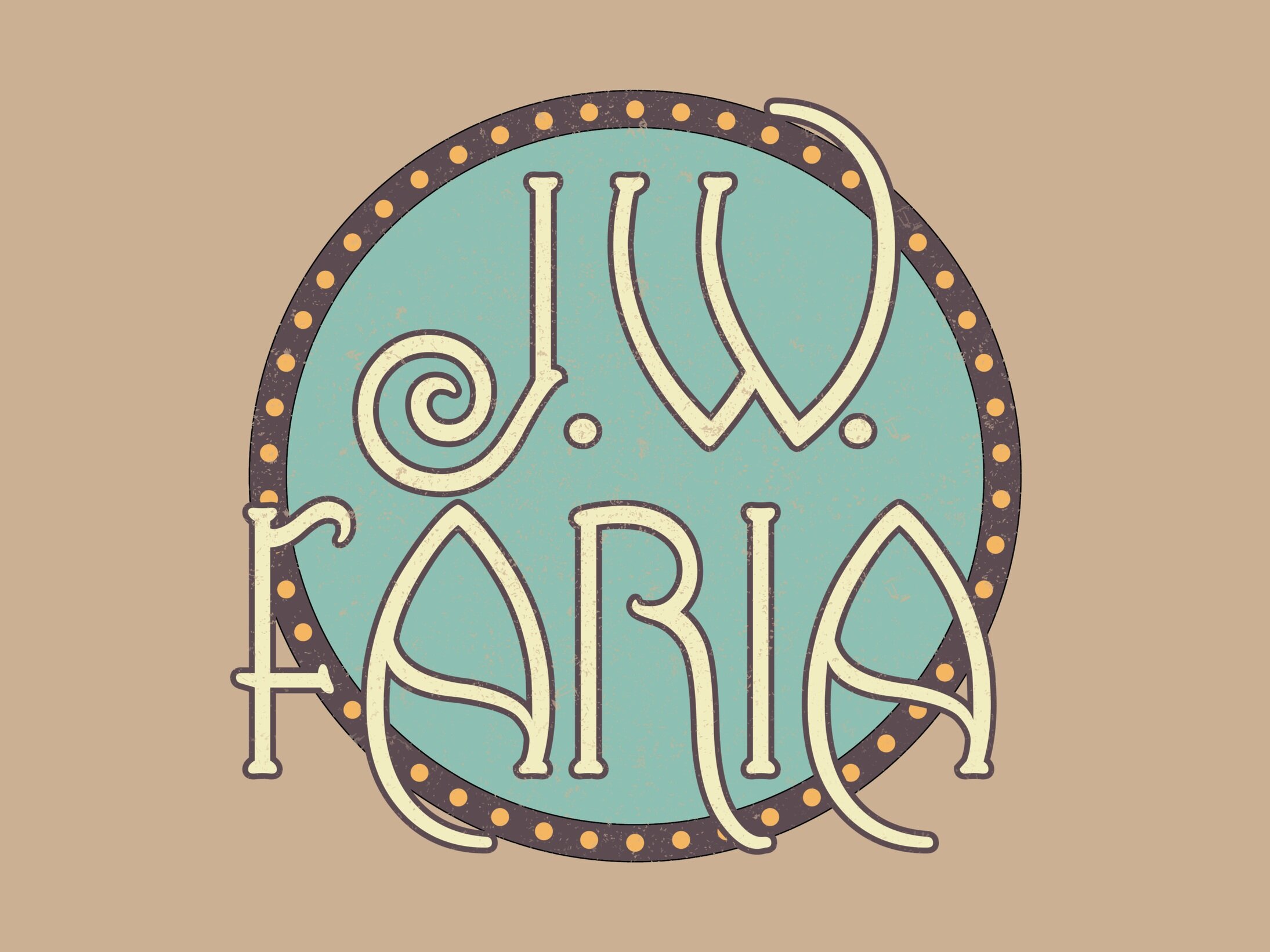
Logo 1: To begin creating J.W.’s branding, I sketched out a variety of logo designs based on the typography used by other country artists he liked. I decided to combine visual elements from these two sketches in the first logo’s design- as seen in the final version above.
Logo 2: For the second logo, I utilized the initial typographic sketch below. He requested I implement classic Native American thunderbird imagery into its final design, which can be seen above. This logo was used for the artist’s merchandise in a variety of colors.
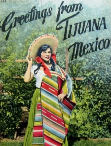
Single Cover 1: For the “Mexico” single cover, I was inspired by vintage postcards- both in imagery and typography. Once deciding on a font, I made two versions with photos of Mexico and various vintage color processing. We decided to keep both for different versions of the song.

Single Cover 2: For the “Lazarus” cover, I began implementing photographs of J.W. into his branding. I decided to cut out the sky of an image he sent me to create space above him, and then insert various backgrounds from the NASA photography database. Once the background worked well compositionally, I color treated the original photo to match the color palettes. Finally, I used a simple serif font for the song title and blended it into the background.
Single Cover 3: I wanted to continue using imagery of the artist, so I used this photo that I found compositionally interesting. We were inspired by the Eagles’ Hotel California album cover, and wanted to use a hand signature style font. I sketched out a font, and then color processed the image to match the vintage feel of the Eagles’ cover.
Result: This project taught me how to listen to a client, synthesize and present ideas, and lead a project so that every piece fits within the whole. I managed to stay on a tight deadline schedule, and lead the overall art direction independently. Both the client and his fans were happy with the final result.


