Bug Bites Branding

Bug Bites
Company Branding and Business System
WHAT: This project was my introduction to large-scale corporate branding, as I had to design the overall color scheme, typography, patterns, logos, mission statement, and name for an edible insect company. I also designed the company’s business system, including the packaging, brochures, letterheads, envelopes, and business cards. My main goal was to design a brand that could convince an average consumer that an unappealing product such as insect protein was appetizing, modern, and fun.
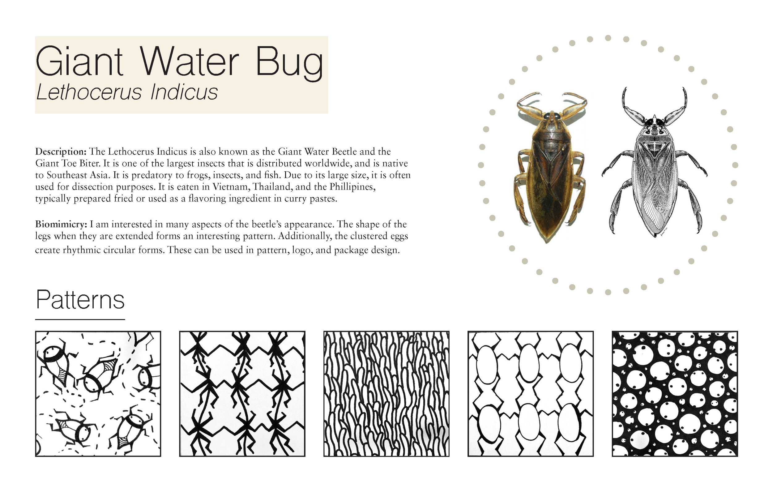
Case Study: I began by studying the Giant Water Beetle itself- the basis for the edible insect snack- to generate ideas for the company name, logo, pattern design, and packaging. I then sketched out different pattern ideas that could be used for all of the company’s media.

Patterns: I decided to simplify my final patterns and take inspiration from Art Deco designs, arriving at the final two patterns above. The wave-like pattern represents water- the home of these beetles- while the triangular pattern mimics the angular form of the beetle itself.
Logo: I then narrowed down my company name and the logo design, deciding on “Bug Bites“ and a simplified silhouette of the beetle for the logo. Along with the final patterns, these decisions communicated the modern and fun branding I wanted to be associated with the company.
Packaging: I then designed the form and layout for the chip packaging. I decided to make it into a pyramid with a rounded handle, to mimic both the angular and wave-like patterns I had made.
Result: This project was invaluable for learning how to unify the brand of a company through all of its media. I learned how to portray a company’s mission and image through color scheme, pattern design, logo design, and language. Turning edible insects into an appealing idea was difficult, but it helped me find the power of design to persuade the viewer to try something new.
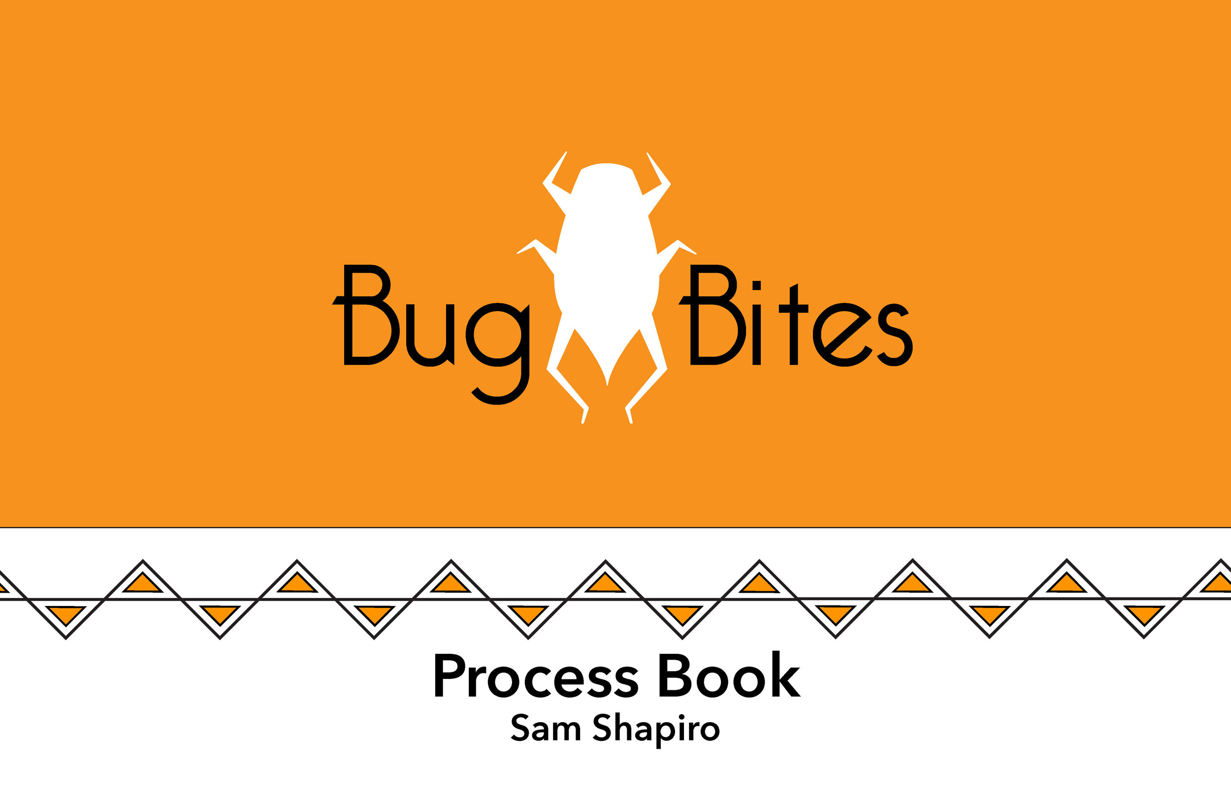
To see more of my process, please check out the full process book below!


